
The ask
Stand out
- A dated logo and no brand behind it
- A crowded HVAC market
- A new electrical company to launch
Case study · HVAC and electrical
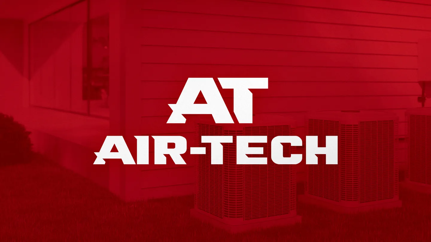
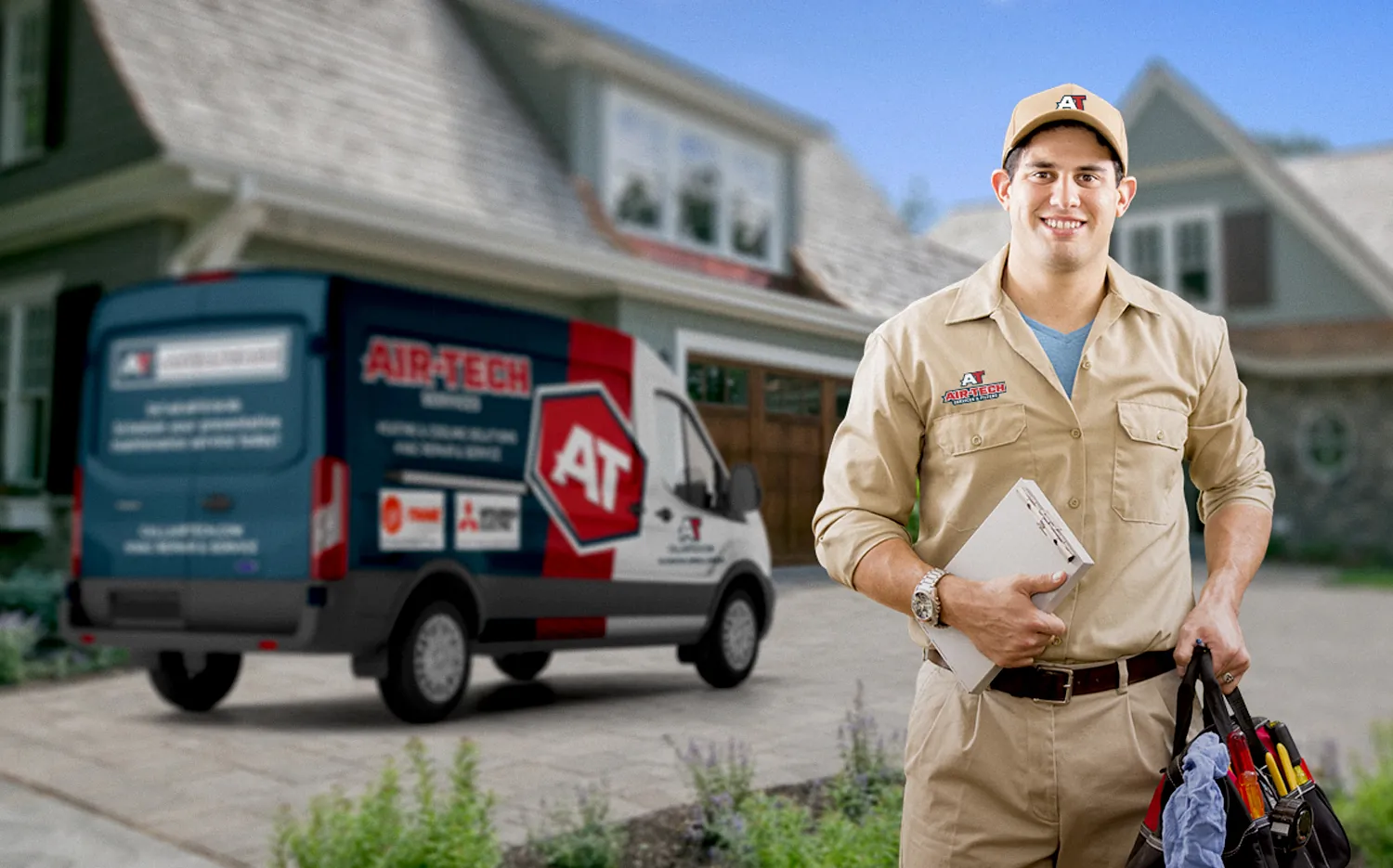
The Tri-Cities is packed with HVAC companies, from one-truck operators to big outfits. In a market that crowded you have to stand out, and Air-Tech’s dated logo blended right in. We rebuilt the brand and gave its new sister company, ATS Electrical, one of its own, so each trade has its own look and they still read as family.
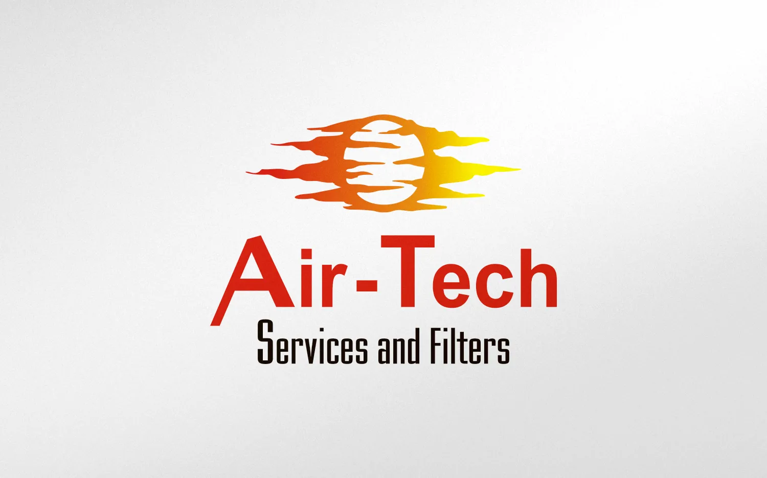
Air-Tech has been doing HVAC in the Tri-Cities since 2007. When they came to us, they had a logo and not much else: no brand colors, no set typefaces, no website. The logo itself, “Air-Tech Services and Filters” under a rising sun, looked dated and was hard to put on a truck or a shirt. They weren’t starting from zero, but they needed the whole brand, not just a new logo.
The owner, Brent, also wanted to grow past HVAC, and electrical was the natural next trade. With ATS Electrical just getting started, it was the right time to give it a brand of its own: one that looked like Air-Tech’s sister company but still stood apart.
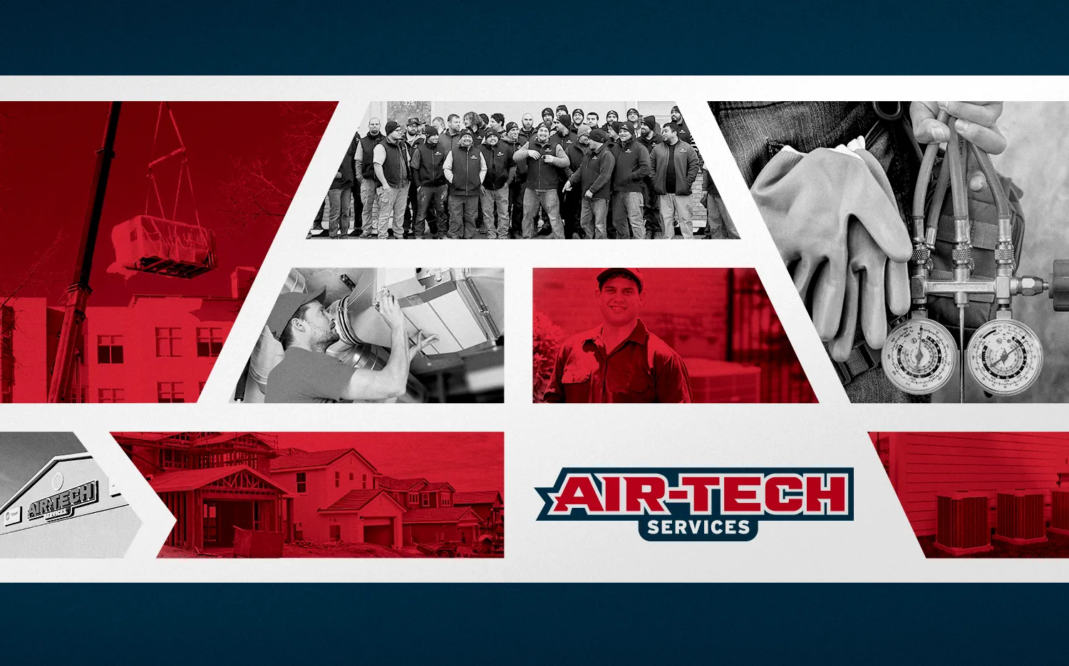
Air-Tech was already a big shop, with a dozen or more trucks, mostly installing systems across whole neighborhoods of new homes. The brand had to look bigger than a mom-and-pop shop, and it had to set them up for what came next: turning every new install into a service customer.
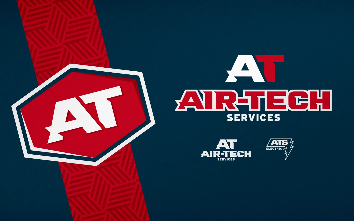
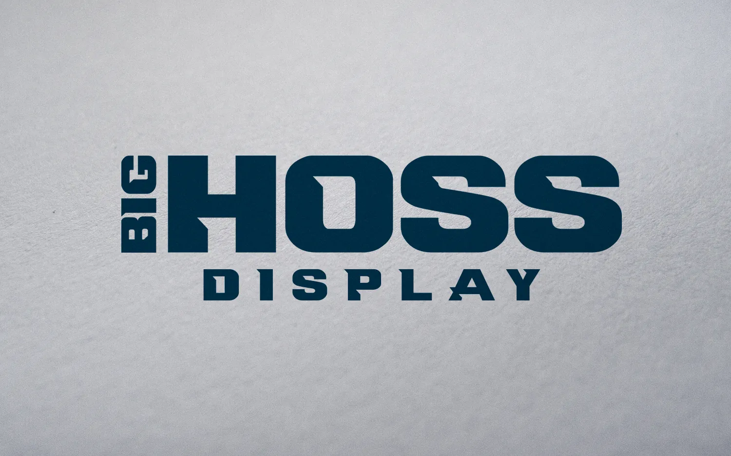
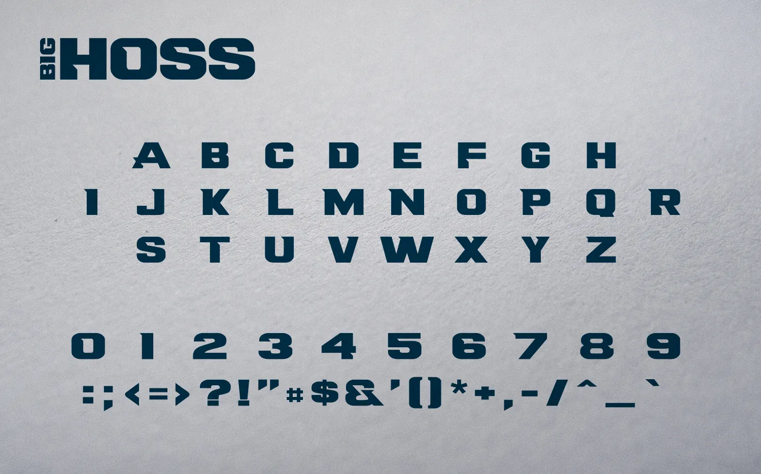
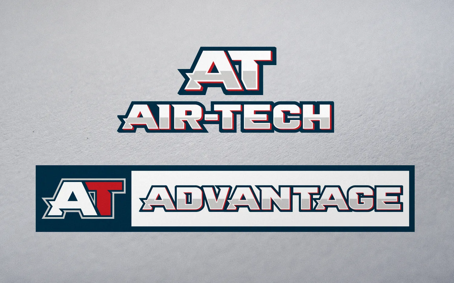
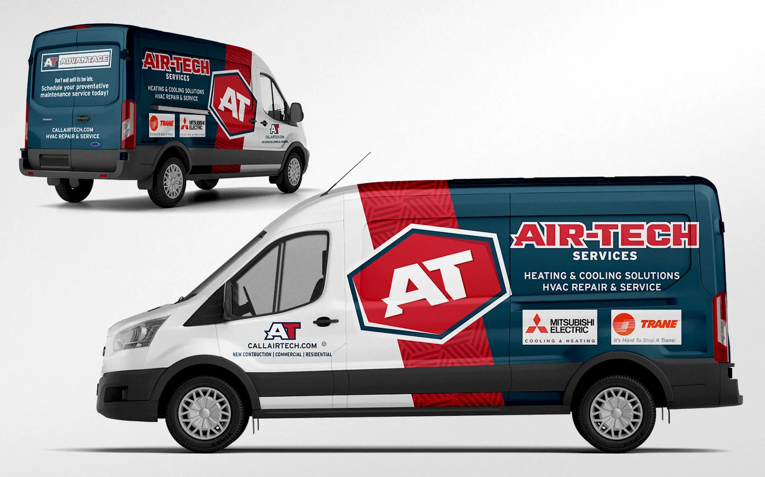
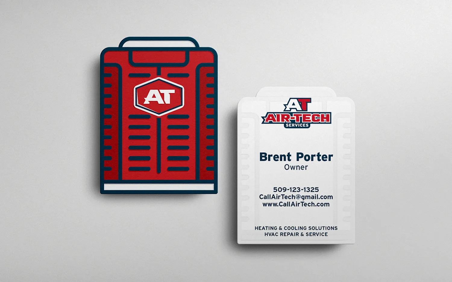
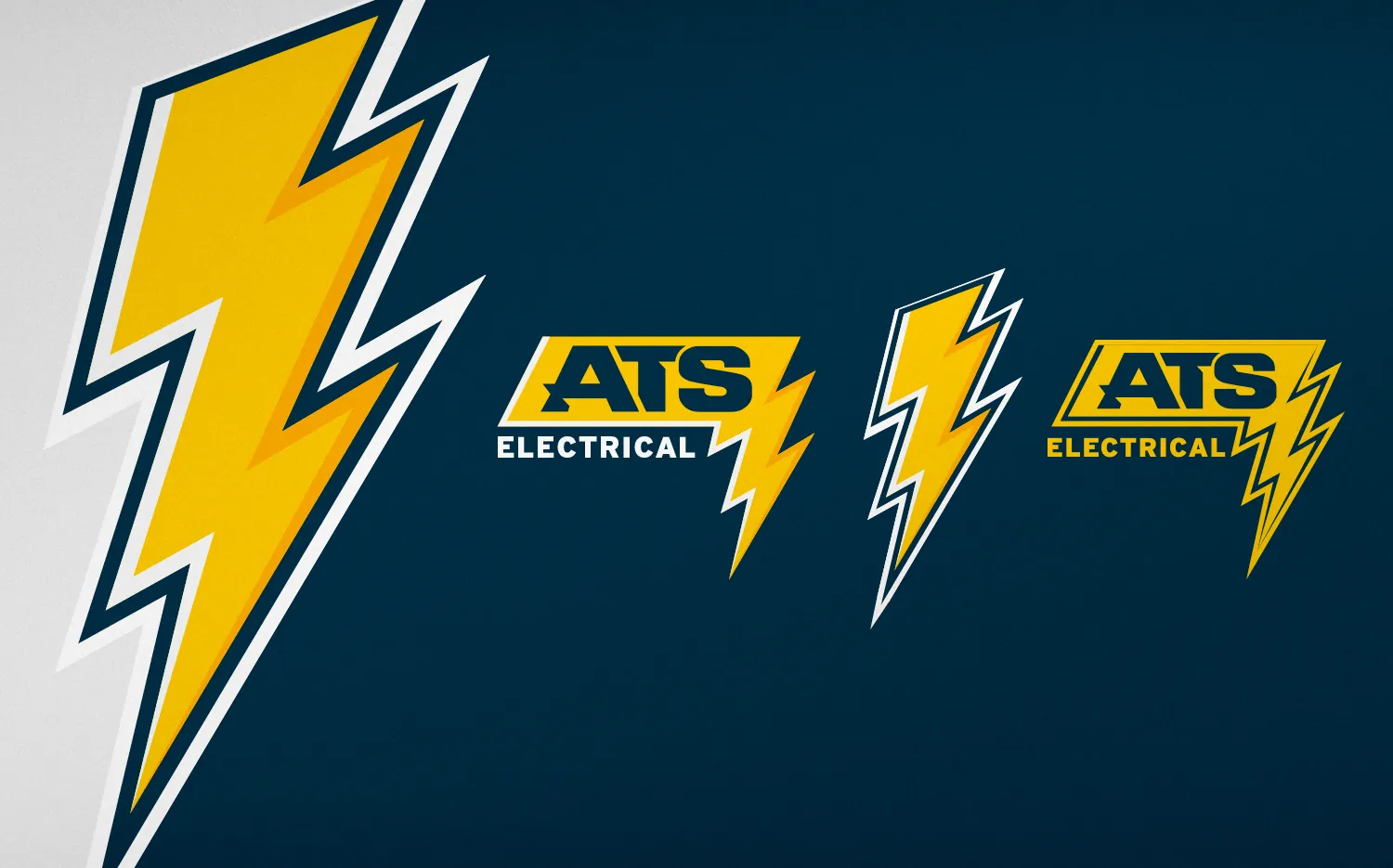
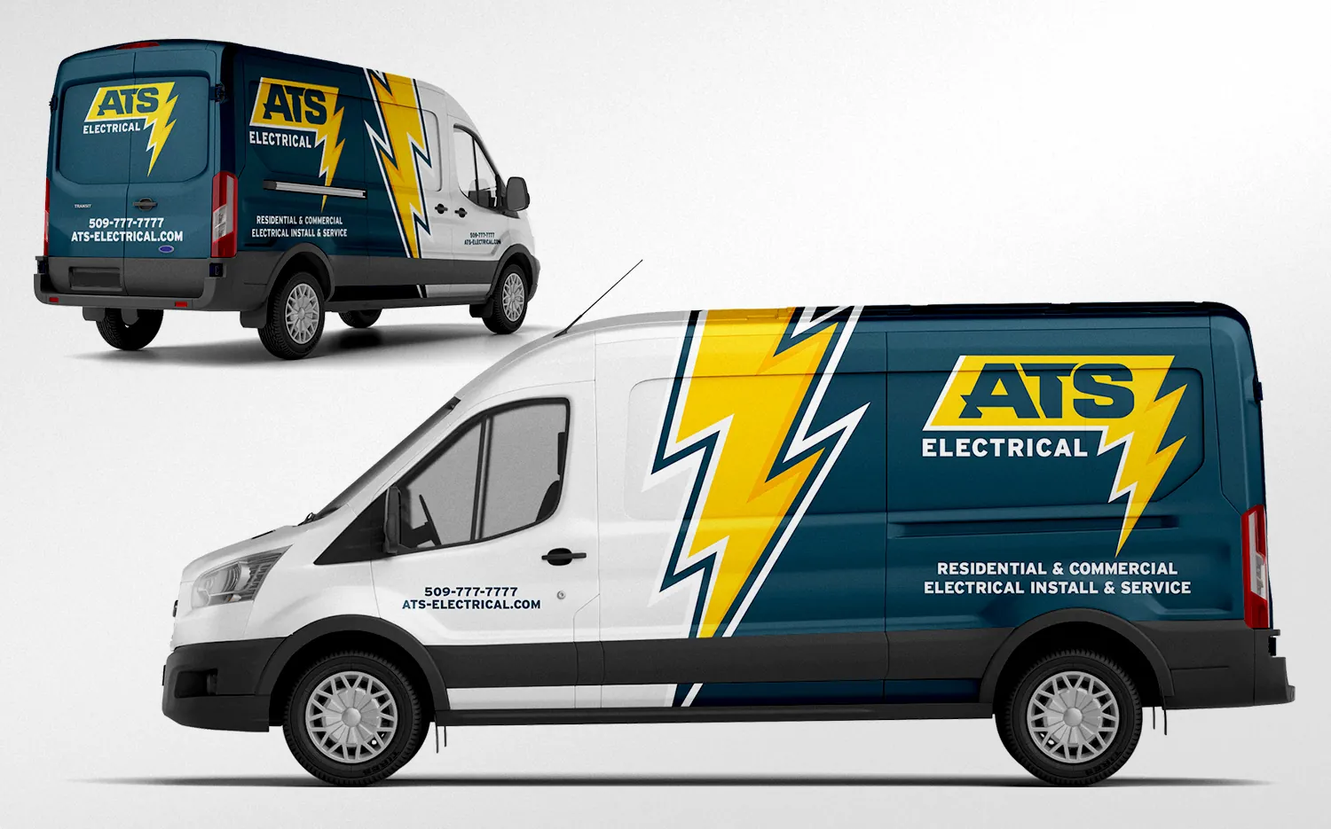
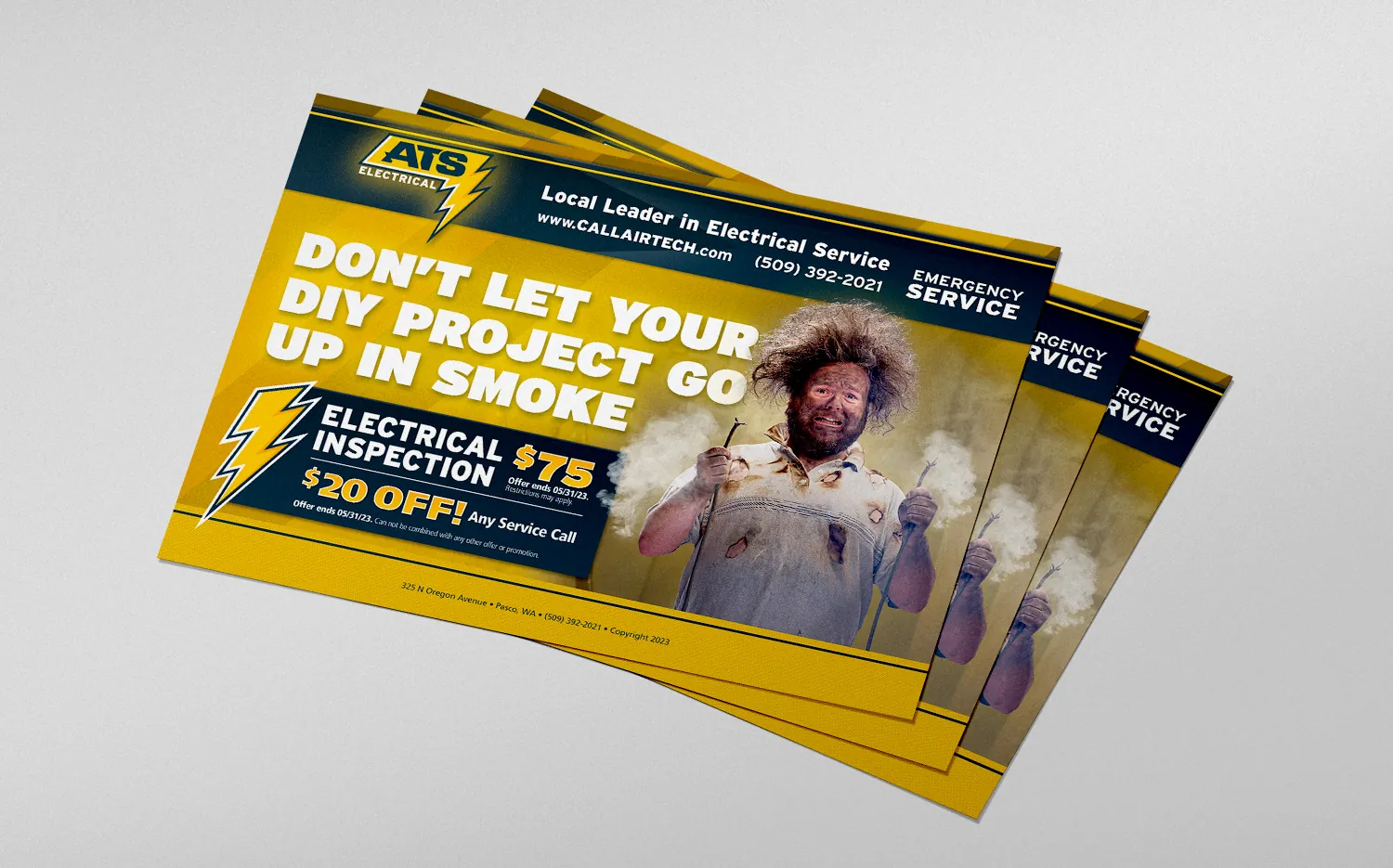
Air-Tech got a heavy AT monogram in a hexagon badge, in navy, red and white, and a custom display typeface, Big Hoss, so the name hits hard on a truck. The AT Advantage maintenance plan got its own mark, so every new homeowner could be offered a plan. ATS Electrical got a lightning bolt in navy and yellow, built with the same type so it reads as Air-Tech’s sister company.
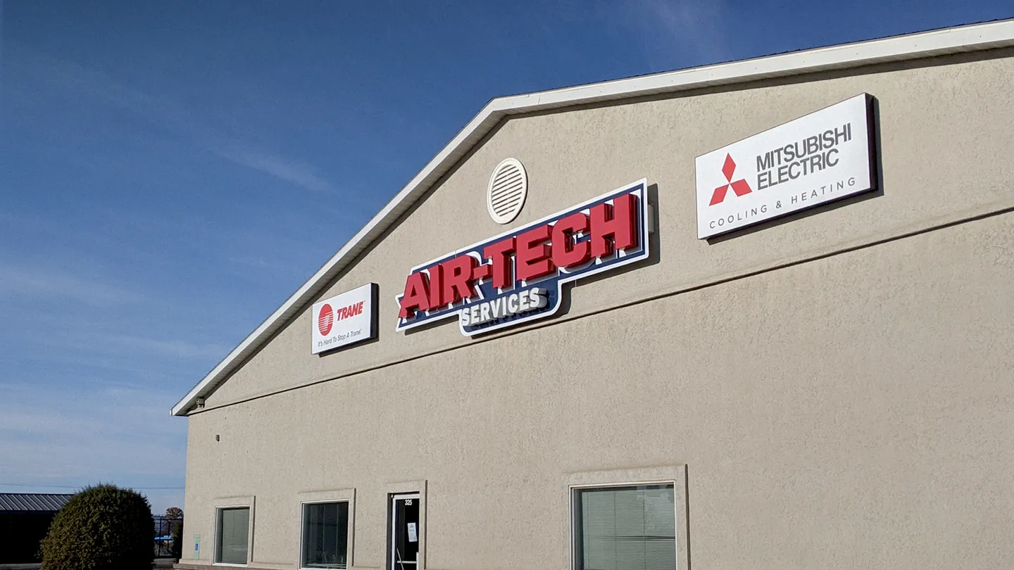
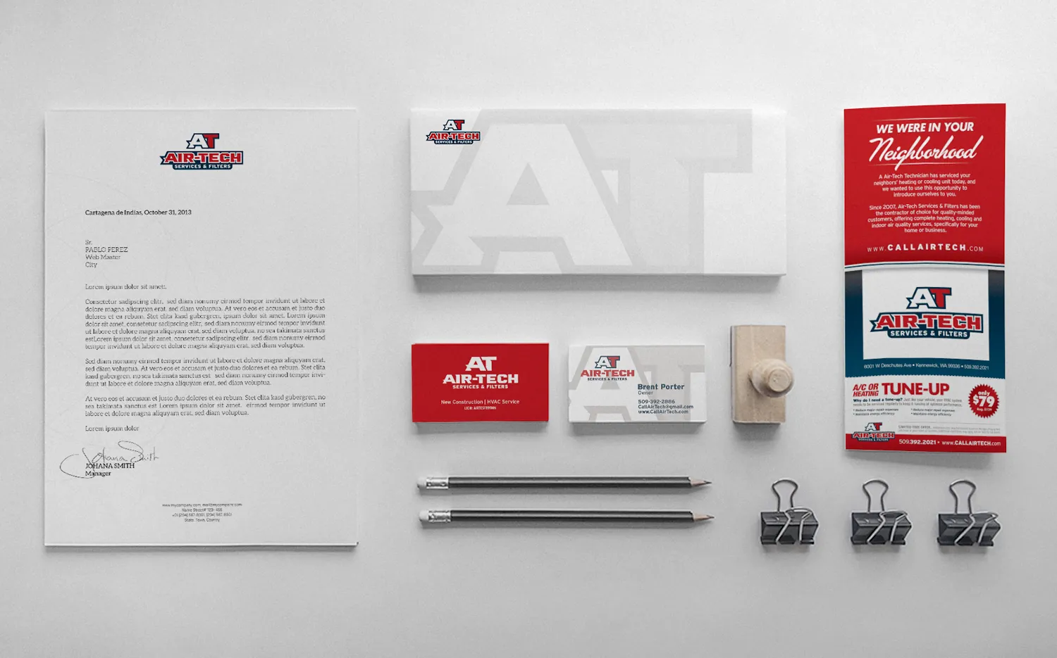
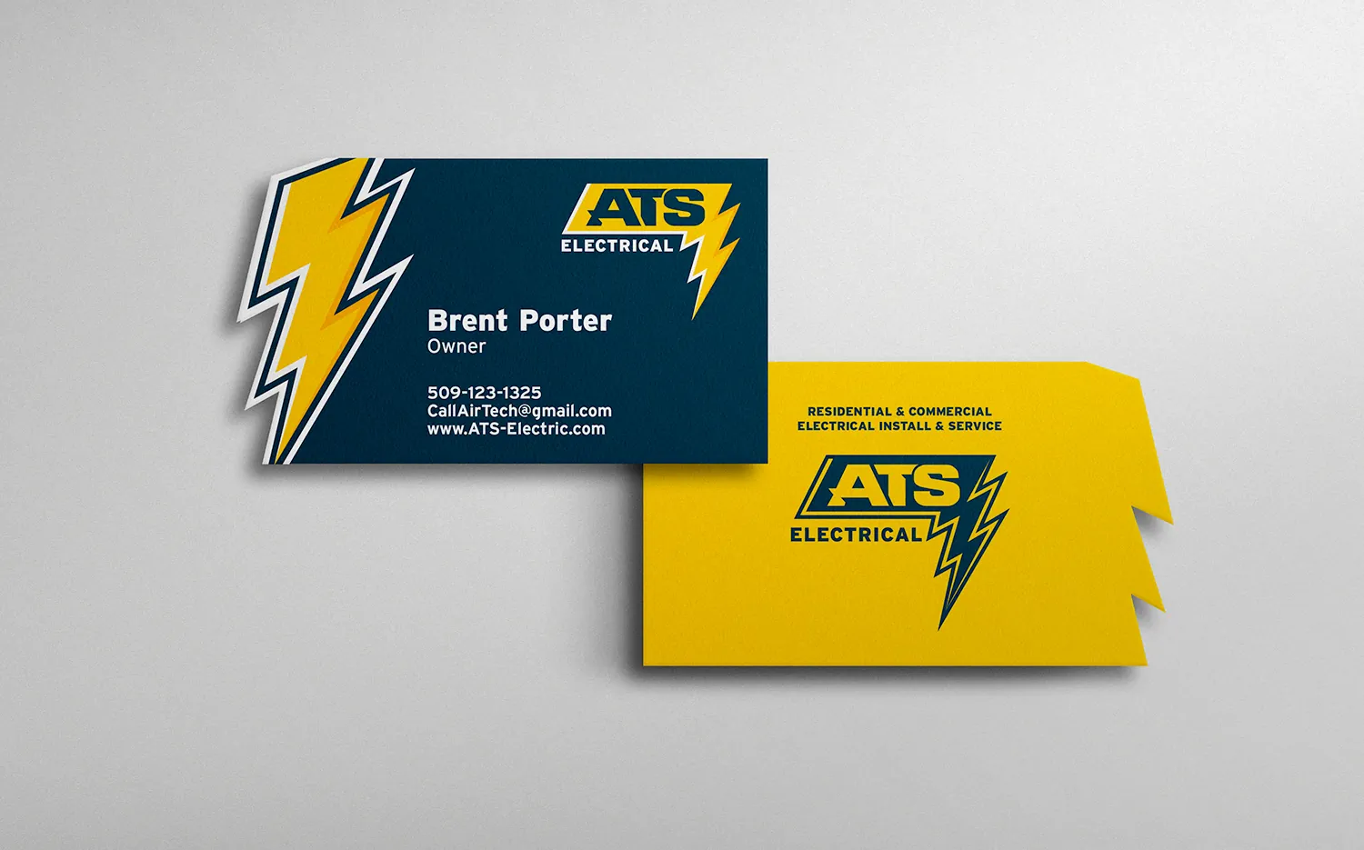
With both brands set, they went everywhere the companies show up: van wraps for both fleets, letterhead and envelopes, and die-cut business cards shaped like an AC condenser and a lightning bolt. Air-Tech’s sign contractor put the new logo up on the building in channel letters.
Marketing pieces followed, like a neighborhood flyer with a tune-up offer and an ATS postcard for homeowners tempted to do their own electrical work.
How the work grew
The ask
The brand
The rollout
Each company has its own colors and its own logo, and each runs as its own business. They share a typeface and a building, so they read as sister companies without blurring together.
The work
Before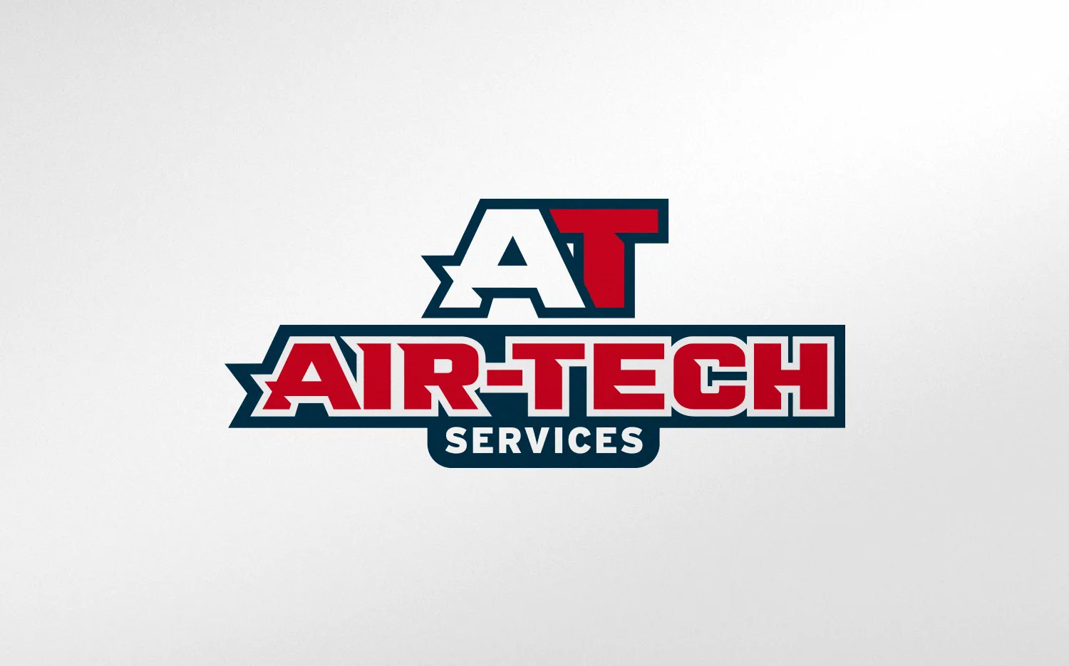 After
The result
The new sign is up on the shop and the wraps are on both fleets.
“Our old branding was lost in the noise, but now we have a new brand, which is really what we needed to move the needle.”